v3.0.1
Swoosh

A brand swoosh behind a word or a short phrase.

-- -- -- 3.0.2

Wait and save or get a ride faster
Overview

Swoosh puts a brand swoosh behind a word or a short phrase — the one accent in a text block. It hugs the text and stretches with it, in any DS text style.

  • 1
    Compact Body
  • 2
    Heading 3
  • 3
    Heading 1
1
5 min
2
5 min
3
save
Examples of Swoosh with various text styles

States

One state — Standard. Swoosh is not interactive; the Figma component stages no State axis. The fill and the text colour are defaults an instance re-points.

Standard

5 min
1
2
  • 1
    Fill --constant-drive-green1 — the default fill, the same in both themes.--swoosh-fill — re-points it to any DS token on the instance.--background-brand — a brand fill keeps the default text colour, in both themes.
  • 2
    Text --text-and-icon-always-dark — the default text colour, the same in both themes.--swoosh-text — re-points it to any DS token on the instance; the slot icons follow it.

On the brand background

save
1
2
  • 1
    Fill --background-primary — the fill on --background-brand.--constant-drive-green1 — not here: ≈ 1.1:1 against the brand green, the swoosh disappears.
  • 2
    Text --text-and-icon-primary — pairs with --background-primary in both themes: a light swoosh with dark text in Day, a dark one with light text in Night.

Anatomy

The swoosh shape behind Figma's Title• (Mode = Expanded) — the text and its two icon slots, exposed on the instance.

save
1
2
3
4
  • 1
    Shape --swoosh-fill — the shape's fill.The exported Figma vector behind the content; it stretches with the box in width and height.Required.
  • 2
    Text Heading/Heading 3 — the default style; any DS text style, one line.Required.
  • 3
    A-slot var(--sp-s24) — an IconContainer before the text; any DS icon, in the text colour.Optional, off by default.
  • 4
    B-slot var(--sp-s24) — an IconContainer after the text; any DS icon, in the text colour.Optional, off by default.

Layout

Swoosh is a horizontal auto-layout that hugs its content. The swoosh shape lies behind the text, absolutely positioned, and stretches with the box; the text sits on top of it.

Structure and paddings

5 min
Compact Body
5 min
Heading 3
save
Heading 1
  • Box var(--sp-s4) — left and right padding.var(--sp-s2) — top and bottom padding.The same for every text style — the swoosh stretches.var(--sp-s0) — corner radius; no fill of its own — the shape is the swoosh.
  • Row var(--sp-s4) — a slot to the text.var(--sp-s24) — a slot icon, whatever the text style.Hug × hug; the children centre vertically.
  • Height Body/Compact Body — 20.Heading/Heading 3 — 32, the default.Heading/Heading 1 — 40.With the slots off: the text's line height plus the two paddings. A slot icon (s24) is taller than a 16 line — Compact Body with a slot is 28.
  • In a Text Row var(--sp-s4) or more — to the neighbouring text. Swoosh takes the same text style as the text around it and aligns by the text centre.

Stretching

5 min Recommended price save save up to 30% save Wait and save
  • Shape Absolute, Stretch × Stretch — it follows the text's width and height.Scaled, not repeated: the longer the text, the flatter the swoosh.
  • Text One line — Swoosh has no Multiline mode.Up to four words; a whole sentence loses the accent.

RTL

save وفّر
  • The Row Mirrors The A-slot moves to the right of the text, the B-slot to the left. The swoosh shape is a brand form, not a directional glyph — it does not mirror. Figma stages no RTL; the web takes it from dir="rtl".

Animation

3 min Live — the ETA updates; the swoosh re-hugs it in the same frame, with no transition. Hover to pause
  • No Motion Of Its Own Swoosh declares no motion token. It is static decoration: it appears and disappears with its host, on the host's motion.
  • Laid Out, Not Animated When the text changes, the box re-hugs it and the shape stretches with the box in the same frame — no width tween, no morph.
  • Reduced Motion Nothing to reduce — no token, no override. The demo holds still under reduced motion and pauses on hover or focus.

Usage

Swoosh marks the one word or phrase in a text block — a title, a row — that carries the point — in the text style of the line around it, with var(--sp-s4) or more to its neighbours.

  • 1
    Onboarding --background-primary — the fill on the brand background.--text-and-icon-primary — the text.The key benefit in the title, in the title's Heading 1.
  • 2
    Tariff Card --constant-orange1 — the fill of a late ETA; the state is said in words too.The ETA in Compact Body — the passenger sees at once how soon the car arrives.

Wait and save or get a ride faster

Offer less if
you’re not in a hurry

Raise a fare
to get more offers

✓ Onboarding — the key benefit, on the brand background
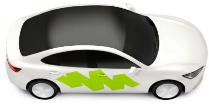
Economy
4 ·3 min
$16
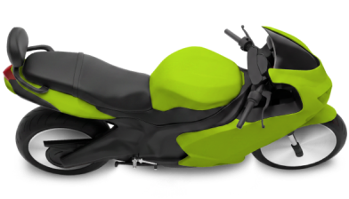
Moto
1 ·25 min · late
$9
✓ Tariff card — an ETA per row; a late one in orange, with the word
Offer less if you’re not in a hurry
✕ A whole sentence — the accent is lost

Wait and save or get a ride faster

✕ Two in one title — neither reads as the accent

Accessibility

The text is the content; the swoosh is decoration. Swoosh is not a control and not an element of its own — its text is read as part of the sentence it sits in.

Wait and save or get a ride faster

  • 1
    One Sentence, No Stops An inline <span> with no role and no tabindex — the host's sentence is read in one go, with no stop or pause at the Swoosh: "Wait and save or get a ride faster"; in a tariff row, "Economy, 4 seats, 3 minutes, 16 dollars". TalkBack: one Text with the swoosh behind a span, or a merged host node whose contentDescription is the whole sentence — a separate, unmerged Text becomes its own focus stop. VoiceOver: the whole sentence as the host's one accessibilityLabel (children: .combine over separate views can pause), with the host's trait (.isHeader in a title, .isStaticText in a row). Web: a reader that still stops on the span gets the sentence as the host's aria-label. Not <mark> — a brand accent, not a search highlight.
  • 2
    The Shape Is Never Announced A ::before with a CSS mask — generated content with no text, never in the tree. TalkBack: drawn behind the text, not a node; VoiceOver: accessibilityHidden(true). The emphasis is visual only — the sentence reads the same without it. In forced colours the background is forced to the system Canvas colour, so the shape blends into the page: the words remain, the accent goes.
  • Slot Icons --swoosh-text — their tint, never --text-and-icon-primary (≈ 1.2:1 in Night on the fill); the Figma master binds AlwaysDark.Decorative by default — aria-hidden="true", TalkBack contentDescription = null, VoiceOver accessibilityHidden(true). A meaningful one ("International") carries role="img" and an aria-label and joins the host's label.
  • Colour Is Never The Only Signal --constant-orange1 — a late ETA's fill; the state is also in the words on screen and in the host's phrase: "Moto, 1 seat, 25 minutes, late".A re-point with no meaning — the brand-background pair — changes nothing in the announcement.
  • Text Scaling The swoosh grows with the text wherever its style scales — Promo Heading and Heading 1 stay fixed, Heading 2 / 3 cap at 130 %, Heading 4 and below scale fully — and stays on one line. Keep it short and check it at the platforms' largest sizes: Android's 200 % font scale, iOS accessibility sizes.
  • Edge States RTL mirrors the slots; the announcement is unchanged. No disabled or error state — a disabled host tints its own text and the Swoosh is read as part of it. An unavailable host keeps the Swoosh's pair and says "unavailable" itself (flagged for Figma). Under the host's skeleton the text is out of the tree. A changing text (an ETA that ticks) is not a live region — the host decides what is announced.
  • Contrast --text-and-icon-always-dark on --constant-drive-green1 — ≈ 14.6:1 in both themes.--text-and-icon-primary on --background-primary — ≈ 17.8:1 Day / ≈ 17.0:1 Night, on the brand background.--text-and-icon-always-dark on --constant-orange1 — ≈ 13.5:1, a late ETA.--text-and-icon-always-dark on --background-brand — ≈ 13.4:1 in both themes, a brand fill.The swoosh against its background is decorative — ≈ 1.2:1 on the page, no non-text contrast duty. A re-pointed pair re-checks 4.5:1 in both themes.