v3.2.0
StatusItem

A centred status block — how an operation ended or what state a screen is in.

3.1 3.1 -- 3.2.2

Payment completed

The receipt is in your email

Overview

StatusItem reports a result or a state in one centred block — the picture of the state, a title, a subtitle and, when the user can act on it, one button. Five types share one layout: success, error, no connection, empty state and warning. Two sizes: Standard for a screen or a tall sheet, Compact for a smaller area.

  • 1
    Standard
  • 2
    Compact

Title

Subtitle

Title

Subtitle

States

Two states — Standard and Skeleton. The block itself is not interactive: no pressed, hover, focused or disabled look; the button carries its own states. The type is content, not a state — the host replaces the block.

Something went wrong

Check the details and try again

Standard
Skeleton
  • 1
    Standard The type's picture, the title, the subtitle and the button, as configured.--text-and-icon-primary — the title and the subtitle.
  • 2
    Skeleton --skeleton-on-white — a square in the TopSlot, one text bar, a button-shaped bar.--pattern-shimmer — the DS sweep across them.

Types — Standard

Standard: the type's illustration — a square vector at 240, fixed in every SP mode. The no-connection type stages the subtitle off.

  • 1
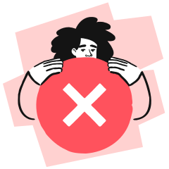
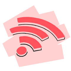
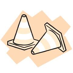
    Success illu/status/indrive-success-state-color.svg
  • 2
    Error illu/status/indrive-error-state-color.svg
  • 3
    No Connection illu/status/indrive-no-internet-color.svg
  • 4
    Empty State illu/status/indrive-empty-state-color.svg
  • 5
    Warning illu/status/indrive-warning-state-color.svg

Payment completed

The receipt is in your email

Something went wrong

Check the details and try again

The connection is lost

Nothing found

Try another address

Check your documents

Some of them expire soon

Types — Compact

Compact: a Squircle M (var(--sp-s48)) tinted per type; empty state is the Squircle's Standard state with its border on.

  • 1
    Success check — the icon.--pastel-green1 — the Squircle fill.--text-and-icon-success — the icon colour.
  • 2
    Error close — the icon.--pastel-red1 — the Squircle fill.--text-and-icon-error — the icon colour.
  • 3
    No Connection internet-off — the icon.--pastel-red1 — the Squircle fill.--text-and-icon-error — the icon colour.
  • 4
    Empty State search — the icon.--surface-on-white — the Squircle fill, with its border on.--text-and-icon-primary — the icon colour.
  • 5
    Warning warning-tr-outline — the icon.--pastel-orange1 — the Squircle fill.--text-and-icon-warning — the icon colour.

Payment completed

The receipt is in your email

Something went wrong

Check the details and try again

The connection is lost

Nothing found

Try another address

Check your documents

Some of them expire soon

Anatomy

A vertical stack of two slots, centred, with no surface of its own — no fill, border or radius; the host's background shows through.

Title

Subtitle

  • 1
    TopSlot The picture of the state — the illustration (Standard) or the Squircle M (Compact); for the Custom type, the host's content.Decorative. Optional — on by default.
  • 2
    BottomSlot The TextContainer and the button. Required.

BottomSlot

Something went wrong

Check the details and try again

  • 1
    Title What happened, in one short line.Heading/Heading 2 — Standard; Heading/Heading 4 — Compact.Optional — on by default.
  • 2
    Subtitle Why, or what to do next.Body/Main Body — both sizes.Optional — on by default; the no-connection type stages it off.
  • 3
    Button One action — Button Secondary, L (Standard) or S (Compact); hugs its label.Optional — on by default. A second action belongs to the host.

Layout

StatusItem fills its host's width — Figma stages it at 360, the phone width. The slots own the spacing; the block has no padding or gap of its own.

Standard

Title

Subtitle

  • TopSlot var(--sp-s16) — top padding; var(--sp-s8) — bottom; sides 0.Height hugs its content — the padding plus the picture; nothing is fixed.--status-item-illustration-size (240) — the illustration, square and fixed: a component-local length, not an SP token, so it holds 240 in every SP mode wherever the mode is set, as in Figma (owner).
  • BottomSlot var(--sp-s16) — top and bottom padding.var(--sp-s20) — left and right padding.Height hugs its content — it grows with the lines of the title and the subtitle and drops a part that is off.var(--sp-s24) — the gap between the text and the button.var(--sp-s4) — the gap between the title and the subtitle.
  • Text And Button Heading/Heading 2 — the title; Body/Main Body — the subtitle. Both centre and wrap, never truncated.Button L — var(--sp-s56), Secondary.Figma keeps the paddings and gaps at 100 % while the text scales; on the web every SP token follows the SP mode.
  • Use A screen or a tall sheet — StatusItem is the main content.

Compact

Title

Subtitle

  • TopSlot var(--sp-s16) — top padding; bottom 0, sides 0.Height hugs its content — the padding plus the picture; nothing is fixed.var(--sp-s48) — the Squircle M; radius var(--sp-s16).
  • BottomSlot var(--sp-s16) — top and bottom padding.var(--sp-s20) — left and right padding.Height hugs its content — it grows with the lines of the title and the subtitle and drops a part that is off.var(--sp-s16) — the gap between the text and the button.var(--sp-s4) — the gap between the title and the subtitle.
  • Text And Button Heading/Heading 4 — the title; Body/Main Body — the subtitle. Both centre and wrap, never truncated.Button S — var(--sp-s40), Secondary.Figma keeps the paddings and gaps at 100 % while the text scales; on the web every SP token follows the SP mode.
  • Use A smaller area — a section of a screen, a card, a short sheet.

Skeleton

Standard — 408
Compact — 180
  • Standard --status-item-illustration-size (240) — the square in the TopSlot, radius var(--sp-s24).--status-item-skeleton-text-width (200, a component-local value) × var(--sp-s44) — the text bar inside var(--sp-s2) padding, radius var(--sp-s8).var(--sp-s120) × var(--sp-s56) — the button bar, radius var(--sp-s20); var(--sp-s8) between the bars.
  • Compact The Squircle M's own skeleton, then a 200 × var(--sp-s16) bar (radius var(--sp-s6)) and a var(--sp-s120) × var(--sp-s40) button bar.Figma stages it as a flat stack — var(--sp-s16) of the block's own padding above and below (32 under the button bar, with the BottomSlot's var(--sp-s16)), no gap between the Squircle and the BottomSlot, no TopSlot padding; reproduced as is.All about the shapes and their shimmer: Skeleton.

Animation

The connection is lost

Live — the shimmer, and the button's press; both hold still under reduced motion
  • Button Press --component-push-button-press / --component-push-button-release — pushButton, the button's own motion; StatusItem adds none.
  • Skeleton Shimmer --pattern-shimmer — the DS sweep, the same as the Skeleton component.
  • No Motion Of Its Own The host swaps the skeleton for the content and replaces one type with another — no cross-fade. The illustrations are static.
  • Reduced Motion Web: --pattern-shimmer and the push tokens resolve to none at the token; no override of its own. The shipped iOS and Android skeletons do not honour the system setting — a flagged gap of the Skeleton component.

Usage

StatusItem stays on screen until the state changes — the content of a screen, a section or a bottom sheet. Short-lived feedback is a Notification or a Snackbar; a page-level banner is a HeaderAlert. The Empty State pattern places the empty-state type on a screen.

  • 1
    Result Of An Operation Success or error after the user's action — Standard when it is the screen's content.
  • 2
    Sheet Or Section Compact in a short sheet or a section that cannot show its content — no connection.
  • 3
    Empty State Nothing to show — the button is off when there is nothing to do.
  • 4
    One Action Two or more actions belong to the host — a sheet's footer, a screen's bottom bar.

Payment completed

The receipt is in your email

✓ 1 · The result of an operation — Standard, the screen's content

The connection is lost

✓ 2 · A short sheet or a section — Compact

Nothing found

Try another address

✓ 3 · An empty search — no action needed

Something went wrong

Check the details and try again

✕ 4 · Two actions — StatusItem carries one; the other goes to the host

Accessibility

The words carry the whole message. Two stops — the text, read as one heading, and the button; a third only for a Custom top slot whose content carries information. What is shown is what is read.

Something went wrong

Check the details and try again

  • 1
    Decorative Picture The illustration and the Squircle repeat the title — hidden on every platform and every type: <img alt=""> and aria-hidden on the web, contentDescription = null / clearAndSetSemantics {} on TalkBack, accessibilityHidden(true) on VoiceOver.Colour is not the only signal — error and no connection share a red Squircle; the text tells them apart.Accepted gap: with both text lines off the picture is the only sign of the state; the host gives it a text equivalent elsewhere.
  • 2
    One Heading The title and the subtitle merge into one element with the heading trait, title first — TalkBack semantics(mergeDescendants = true) { heading() }, VoiceOver children: .combine + .isHeader.Web: a heading (level from the host's outline) and a <p> — the browser reads two lines, the heading first. With the title off the subtitle stays a <p>, so no heading remains on the web; the platforms keep the trait.What is shown is what is read: a line that is off is not read; with both off there is no text element and the button is the only stop.
  • 3
    Button The Button contract unchanged — its label names the action ("Try again"), not the state.An unavailable action is omitted, not disabled.Compact's Button S (var(--sp-s40)) is below the DS 48: its hit region grows to 48 into the var(--sp-s16) free above and below it — on the web a transparent ::after; on the shipped mobile builds unverified.
  • Announcing The host decides, by how the block appears. On screen load — reading order. Inside a modal sheet — the sheet owns focus.Replacing the whole screen — focus moves to the text, and that read is the announcement. TalkBack Views ACTION_ACCESSIBILITY_FOCUS on the merged text; Compose has no public focus API — paneTitle carries the whole text (title and subtitle), a recorded gap. VoiceOver @AccessibilityFocusState / .screenChanged. Web .focus() on .status-item__text, which carries tabindex="-1".Replacing a section — one polite announcement, focus stays: TalkBack a polite live region on a node that exists before and after the swap (not verified on the shipped builds); VoiceOver a queued announcement — UIKit UIAccessibility.post(.announcement, NSAttributedString) with .accessibilitySpeechQueueAnnouncement, SwiftUI (iOS 17+) AccessibilityNotification.Announcement(…).post(); web a dedicated, empty role="status" the host writes the text into — role="status" is atomic, so a region around the block would re-read the button too.No alert semantics — an error StatusItem is content.
  • Retry Focus decides, never both. Button Loading (preferred) keeps focus on the button: if the result keeps the button, the result is announced — even when its text repeats; if the result removes it, focus moves to the new text, which reads it.A repeated identical result: TalkBack and the web clear the live region for a moment before writing it; VoiceOver posts an announcement per result.Skeleton retry removes the focused button — the host first parks focus on the loading region, then moves it to the new text.
  • Skeleton Not announced, not focusable — the shapes are hidden. Web: "Loading" is the text of a separate role="status" node without aria-busy; aria-busy goes on the region being loaded.iOS: the hasDsSkeleton path hides the shapes; the unconditional dsSkeleton(...) does not. Android: the DS skeleton sets no semantics — the host hides the shapes (gaps flagged on Skeleton).
  • Text Scaling Heading/Heading 2 — the Standard title caps at 130 %; Heading/Heading 4 and Body/Main Body scale to 150 %, the DS maximum. Both below WCAG 1.4.4's 200 % — the DS-wide rule.The illustration holds 240; the lines wrap; at the larger modes the host's area scrolls.
  • Reduced Motion Web: the shimmer and the button press resolve to none at the token. The shipped iOS and Android skeletons do not honour the system setting — a flagged gap of the Skeleton component.
  • Custom Type The host's top content is decorative unless it carries information the text does not — then it is its own labelled stop before the text.
  • Structure And RTL The root is a plain <div> — no landmark; a full-screen host names its own <main> or <section>. Centred, so it reads the same in RTL; the button follows its own RTL contract.
  • Contrast --text-and-icon-primary on --background-primary — ≈ 17.8:1 Day / ≈ 17.0:1 Night.--text-and-icon-warning on --pastel-orange1 — ≈ 2.7:1 Day; a decorative graphic, exempt from WCAG 1.4.11 (the DS-wide pastel fact).
  • Forced Colours Windows High Contrast (browser defaults, no rule of its own): the text and the button take the system colours; the Squircle fill is forced to Canvas and its icon to the text colour, so the icon stays visible; the illustration keeps its artwork colours.
  • Shipped Builds Both platforms ship DsStatusItem (Figma 3.1); the bridges carry no accessibility data, so the shipped behaviour is not verified.