v3.0.0
CarouselContainer

A horizontally scrolling row of DS components — promo banners, paged slides, home-screen shelves.

-- -- -- 3.0.2

Promotions

Overview

CarouselContainer lays a row of items out horizontally and lets the user scroll it. It owns the row — width, insets, gaps, snapping, the position indicator and autoplay — and nothing inside the items: each item's content slot takes any DS component. The item width is computed from the container's width, so one configuration serves every screen.

  • 1
    Peek
  • 2
    Paged
  • 3
    Shelf
1

Promotions

2

What's new

3

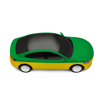
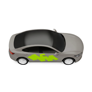
Choose a ride

Styles and States

The mode — Peek, Paged, Shelf — is the style axis; it sets the item width, the snapping and the indicator (see Overview and Layout). CarouselContainer paints nothing of its own except the page indicator: the colour of every item comes from its content. The states differ by mode, so each mode lists its own below; the rest state is Standard in every mode.

Styles · Page indicator below

1
2
3
  • 1
    Dot — Current --text-and-icon-primary — the fill (candidate).Also wider than the others — colour is not the only signal.
  • 2
    Dot — Other --surface-contrast-overlay — the fill: black 20% in Day, white 24% in Night; the alpha is in the token, no layer opacity.
  • 3
    Container, Track, Item No fill, no border, no radius, no shadow — transparent in both themes.No Pressed, Disabled or Skeleton state of their own: those belong to the item's content.

Styles · Page indicator over the row

1
2
3
  • 1
    Pill --surface-dark-overlay — the fill: black 20% in Day and Night; the alpha is in the token, no layer opacity.Radius var(--sp-s28) — a pill at every height. Only with pageIndicator: overlay (Figma Background=on); Below has no fill.
  • 2
    Dot — Current --text-and-icon-always-light — white in both themes, so it reads over a page's image, dark banners first (2026-11-12).
  • 3
    Dot — Other --surface-white-overlay — white 16%, quiet beside the current dot.
  • Page The pill lies over the item's content, which brings its own colour — here a dark slot stands in for a photo banner.

Peek · Standard

  • Peek Behaviour Snaps to the item's start at the edge inset, one item per swipe.The neighbour peeking in by var(--sp-s28) is the indicator — no dots, no autoplay.
  • Standard The first item at var(--sp-s20) from the start edge; the next item peeks in at the end edge. At rest on a snap point.

Peek · Scrolling

  • Scrolling The row between snap points while the user drags — both neighbours partly visible. On release it settles on the nearest item's start, one item per swipe.

Peek · Item focused

  • Item Focused Keyboard or screen-reader focus on item 3 scrolls it to its snap point: the next item peeks in by 28 at the end edge, and the previous one shows 12 at the start edge (edge inset − gap). The focus ring is the content's own — shown here with the DS ring.

Peek · End of row

  • End Of Row The last item aligns to the end edge at var(--sp-s20); the previous item peeks in from the start side by var(--sp-s28). The row cannot scroll further, and there is no peek at the end edge.

Peek · Single item

  • Single Item One item at the container width minus two var(--sp-s20) edge insets — no scrolling, no snapping, no peek.

Paged · Standard

  • Paged Behaviour One item per page, W − 2 · edge inset wide; pages are spaced by var(--sp-s8), as in the Figma component.The dots are the indicator. Autoplay is available in this mode only.
  • Standard Page 1 at var(--sp-s20) from the start edge; the next page shows 12 at the end edge (edge inset − gap); the first dot elongated in --text-and-icon-primary.

Paged · Scrolling

  • Scrolling Two pages partly visible while the user drags. A fling stops on the next page and never skips one; the dot changes when the row settles.

Paged · Middle page

  • Middle Page Page 2 of 4: the second dot elongated in --text-and-icon-primary, the others --surface-contrast-overlay.

Paged · Last page

  • Last Page The last page with the last dot elongated. With loop off the row stops here, and autoplay ends on it.

Paged · Autoplay running

Autoplay running — touch, scroll or focus the row to stop it
  • Autoplay Running The pages advance on their own every interval — 7 s by default, 3 s in this live demo — on moveM. Autoplay pauses while the pointer hovers the row (web).

Paged · Autoplay stopped

  • Autoplay Stopped The row stays on the page the user stopped on. The first interaction — a touch, a swipe, a wheel scroll, keyboard or screen-reader focus — stops autoplay, and it does not resume on its own; there is no pause control. An assistive technology or Reduce Motion holds it off from the start.

Paged · Indicator over the row

  • Indicator Over the Row pageIndicator: overlay puts the dots over the page's bottom edge, on a --surface-white-overlay pill; the row is as tall as its items.For dark or photo banners where the height counts — the pill reads on them; on a light banner the white 16% all but disappears. Not for pages with text or a button at the bottom centre.

Paged · Indicator alignment

  • Center, Start, End pageIndicatorAlign — center by default, start or end; in both placements. Above: Below at the start, Overlay at the end.At the start or end the indicator sits var(--sp-s12) in from the edge inset. Start is the left edge in LTR and the right in RTL.

Paged · Without page indicator

  • Without Page Indicator pageIndicator: none turns the page indicator off — the dots and the slot they sit in under the row are gone.The page still snaps and each item still announces its position, but nothing on screen shows that the row scrolls.

Paged · Single item

  • Single Item One page and no dots — no scrolling, no autoplay.

Shelf · Standard

  • Shelf Behaviour Fixed-width items, free scroll with no snapping.The item cut by the edge is the indicator — no dots, no autoplay.
  • Standard The first item at var(--sp-s20) from the start edge; the last visible item cut by the end edge.

Shelf · Scrolled

  • Scrolled Free scroll — the row rests wherever the momentum ends, with items cut on both edges.

Shelf · Item focused

  • Item Focused Keyboard or screen-reader focus scrolls the item fully into view. The focus ring is the content's own — shown here with the DS ring.

Shelf · End of row

  • End Of Row The last item aligns to the end edge at var(--sp-s20); the row cannot scroll further.

Shelf · Few items

  • Few Items Items that fit in the row keep their width (var(--sp-100-s96) by default), starting at var(--sp-s20); the rest of the row stays empty. No scrolling. This is the default — Shelf does not stretch its items.

Shelf · Few items, stretched

  • Few Items, Stretched stretchItems: true — the items share the container width minus two var(--sp-s20) edge insets equally: (360 − 40 − 2 · 8) / 3 ≈ 101.Applies only while the items fit; once they overflow, the item width applies and the row scrolls.

Shelf · Single item

  • Single Item One item at its own width, at var(--sp-s20) from the start edge — no scrolling. With stretchItems it takes the whole row.

Anatomy

A container with a scrolling track of CarouselItems, each with one content slot, and — in Paged — a decorative page indicator. The section title above the row is a separate component.

1
2
3
4
  • 1
    Track --cc-edge — the edge inset on both ends, also the snap point.The scrolling row; the container clips it at its edges. No fill, border or radius of its own.Required.
  • 2
    CarouselItem Width per mode, computed from the container width; height follows the content, and every item stretches to the tallest.Required, 1…N.
  • 3
    Content Slot Any DS component. The item has no fill or radius of its own; the content brings its shape.Required.
  • 4
    Page Indicator One dot per item, the current one elongated. Decorative — not tappable, hidden from the screen reader.Paged only — below the row by default, over it on a pill, or off.

Layout

Every offset is an SP token, and the item width is computed from the container width W — the redlines are drawn at W 360. The item is shown as its empty content slot.

Peek

  • General var(--sp-s20) — the edge inset: the first item's offset from the start edge, the last item's from the end edge, and the snap point.var(--sp-s8) — the container's padding above and below the row.var(--sp-s8) — the gap between items; var(--sp-s4) for a dense row.var(--sp-s28) — the peek: the visible part of the next item.Height by content — the row is as tall as its tallest item.
  • Item Width W − edge inset − gap − peek: 360 − 20 − 8 − 28 = 304.Two per view: (W − edge inset − gap − peek − gap) / 2 = 148.A cap (--cc-item-max) stops the width; the peek then grows — 82 at W 430 with a 320 cap.

Paged

  • General var(--sp-s20) — the edge inset on both sides; var(--sp-s8) above and below.var(--sp-s8) — between pages, as in the Figma component: at rest the next page shows 12 — kept (owner, 2026-11-12).Height by content.
  • Item Width W − 2 · edge inset: 360 − 40 = 320.
  • Page Indicator var(--sp-s4) — the indicator's padding around the dots.Centred by default; at the start or end, var(--sp-s12) in from the edge inset.Below: var(--sp-s4) above the indicator and var(--sp-s8) under it — 8 from the row to the dots, centred.Overlay: var(--sp-s8) above the page's bottom edge, on a pill — --surface-white-overlay, radius var(--sp-s28).var(--sp-s6) — a dot; the current one var(--sp-s16) × var(--sp-s6), radius half its height.var(--sp-s4) — between dots. Up to 7 dots.Below by default; with Overlay or none the row ends at the items.

Paged · Page indicator

Background off — Below
Background on — Overlay
  • Dots var(--sp-130-s6) — a dot, radius half its height; the current one var(--sp-130-s16) × var(--sp-130-s6).var(--sp-130-s4) — between dots; one dot per item, up to 7.Current — --text-and-icon-primary; the others — --surface-contrast-overlay.
  • Indicator A row of dots centred on both axes, padded var(--sp-s4) on every side — 14 high, 44 wide with 3 dots.Background off — no fill, under the row (Below). Background on — --surface-white-overlay, radius var(--sp-s28), over the page (Overlay). The dark backdrop here only makes the pill visible.RTL — the dots run right to left.
  • Bottom Slot Holds the indicator: var(--sp-s4) above, var(--sp-s12) in from the edge inset on both sides, var(--sp-s8) below.Below — under the row, 8 from the row to the dots. Overlay — pinned to the page's bottom edge, the pill var(--sp-s8) above it, no height reserved.Centred by default; pageIndicatorAlign: start / end moves it to an edge, mirrored in RTL.

Paged · Page indicator scaling

SP 100% · 6 / 16, gap 4
SP 130% · 7.8 / 20.8, gap 5.2
SP 150% · held at 130% · 7.8 / 20.8, gap 5.2
  • Scaling — Cap130 The dots and the gaps between them grow with the SP mode up to 130% and hold that size at 150% — the cap130 mode of Heading 2 / 3.var(--sp-130-s6), var(--sp-130-s16), var(--sp-130-s4) — the cap130 family: it holds the 130% value at 150%.The indicator's padding and its offsets — var(--sp-s4), var(--sp-s8) — scale fully with the rest of the layout.

Shelf

  • General var(--sp-s20) — the edge inset; var(--sp-s8) above and below.var(--sp-s8) — the gap; var(--sp-s4) for a dense row.Height by content — no minimum.
  • Item Width --cc-shelf-width — fixed in every SP mode, var(--sp-100-s96) by default (72–200); the artwork fixed too, only the text grows.Items that do not fill the row keep the width; stretchItems shares the row between them.

RTL

  • The Row Mirrors Direction follows the locale — no separate parameter. The first item sits on the right, the track scrolls the other way, the Peek neighbour peeks in from the left and the dots run right to left. The offsets are the same.

Animation

Live — autoplay advances on moveM every 3 s; touch or scroll the row to stop it
  • Programmatic Scroll var(--component-move-m-appear) — moveM, 400 ms on the standard curve.An autoplay advance, or focus moved to an off-screen item.
  • Dot Change var(--transforming-state-default) — the dot's colour (candidate).The current dot elongates to var(--sp-s16); the width is not animated.
  • Swipe, Fling, Snap The platform's native scroll physics — not tokenised.
  • Reduced Motion The motion tokens are zeroed at the token, so a programmatic scroll becomes a jump with no override of its own. Autoplay does not start under Reduce Motion.

Usage

Peek for promo banners and featured offers, two per view for paired cards; Paged for a short sequence of full-width slides where the position matters; Shelf for category tiles, rides and routes. Not for content the user compares side by side, and not as the only path to a key action — items off-screen are easy to miss. Dots inside a card, where the card's content pages, are a different pattern.

Promotions

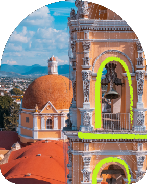
✓ Peek — promo banners, one per view, the next peeking in

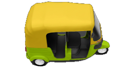
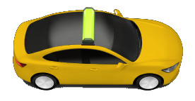
Choose a ride

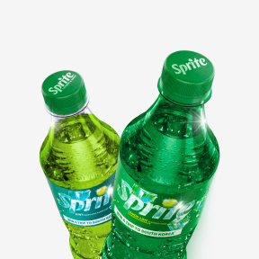
✓ Shelf — many small items, scanned rather than read

Choose a ride

✓ Shelf — tariffs, a tile per vehicle

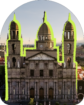
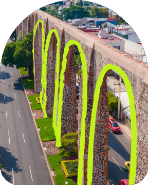
Intercity

✓ Shelf — routes with a picture and a price

Groceries

✓ Shelf — a short row keeps its item width

Promotions

✕ Peek and dots together — the row shows one indicator
✕ More than 7 pages — the dots stop being countable

Accessibility

The container is a named row; each item is one stop that says where it is in the row. Moving focus scrolls the row — a screen-reader user never has to swipe the row itself to reach an item.

Promotions

1
2
3
  • 1
    Named By Its Section The row is named by its section title, never "Carousel". TalkBack: the SectionHeader heading carries the name, then the row is a list — CollectionInfo, "in list, 5 items". VoiceOver: the heading, then accessibilityContainerType = .list — "list start". Web: <section aria-roledescription="carousel" aria-label="Promotions">, with "carousel" localised.
  • 2
    One Stop Per Item, With Its Position TalkBack: one merged node, "20% off your first ride, Learn more, button, item 2 of 5" — CollectionItemInfo gives the position. VoiceOver: one element whose label ends in a localised "2 of 5"; .button set explicitly — combining does not add it. Web: role="group" aria-roledescription="slide" aria-label="2 of 5", the content follows. An item with several controls is not a stop of its own: the controls are focused one by one and the first carries the position.
  • 3
    Decorative Dots Hidden and not tappable — TalkBack clearAndSetSemantics {}, VoiceOver accessibilityHidden(true), web aria-hidden="true" on spans, never buttons inside a hidden container. The item announces the position.
  • Paging VoiceOver: a three-finger swipe pages the row (accessibilityScroll) and the app posts a localised "Page 2 of 5" — app-supplied, not produced by the platform. TalkBack: ACTION_SCROLL_FORWARD / BACKWARD page the row and TalkBack speaks its own "showing items 2 to 3 of 5". In RTL forward moves toward the visual left.
  • Keyboard And Switch Access Tab reaches each item that holds a control, and focusing it scrolls it to its snap point. Items with nothing focusable make the track itself the stop — tabindex="0", named after the row, with a focus ring; Left / Right move it item by item (mirrored in RTL), Home / End to the ends. No Previous / Next buttons (owner, 2026-11-12): Paged has no single-pointer alternative to the swipe — the WCAG 2.5.1 gap is accepted.
  • Autoplay iOS / Android: does not run while TalkBack, VoiceOver, Switch Access / Control or Voice Access / Control is on. Every platform: not under Reduce Motion; stops at the first interaction, one during an advance included.Web: a browser cannot detect a screen reader, and in NVDA / JAWS browse mode the virtual cursor fires no stop event, so the row keeps advancing under a reading user. No live region — the row only scrolls.Known gap: there is no pause control (owner, 2026-11-01), and WCAG 2.2.2 asks for one a reading user can find.
  • Edge States Zero items: the row goes with its SectionHeader, no empty list. Single item: no list, no "1 of 1", no slide role. Loading: the skeleton is one "Loading" node; the list is announced once the items arrive, without moving focus. Items changing under focus keep it on the same item.
  • Contrast --text-and-icon-primary on --background-primary — the current dot, ≈ 17.8:1 Day / ≈ 17.0:1 Night.--surface-contrast-overlay — the other dots, ≈ 1.6:1 Day / ≈ 2.2:1 Night; decorative, so no contrast floor applies.The current dot also differs in shape — colour is not the only signal.