Vertical content surface — a self-contained unit combining optional media/icon slots with a text block. The shipped component is the customCard base preset; ready-made presets are assembled from it.
--
--
--
3.3.21
Text
Text
Overview
Three things ship today: the open customCard base and two product variants. Card is a vertical surface — StartSlot to StartText to EndSlot on a configurable background, plus an optional CornerSlot overlay. A horizontal row with start text and end media is Cell, not Card.
1
customCardThe base — every axis open (slots, layout flow, media pin, surface, radius, paddings, gaps, typography). Assemble anything from it; the locked product contracts live in the spec (§8).
2
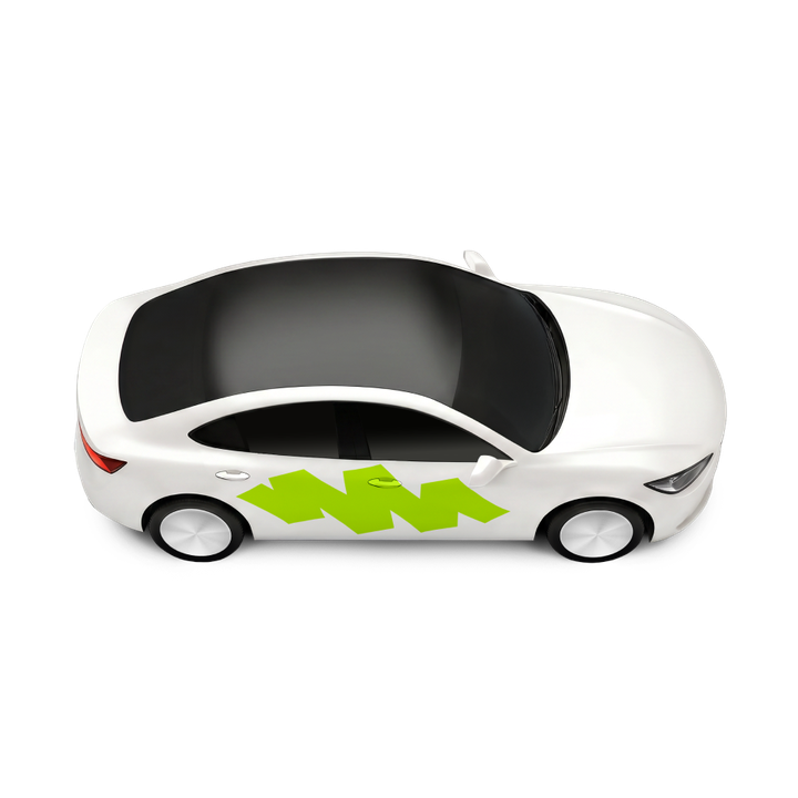
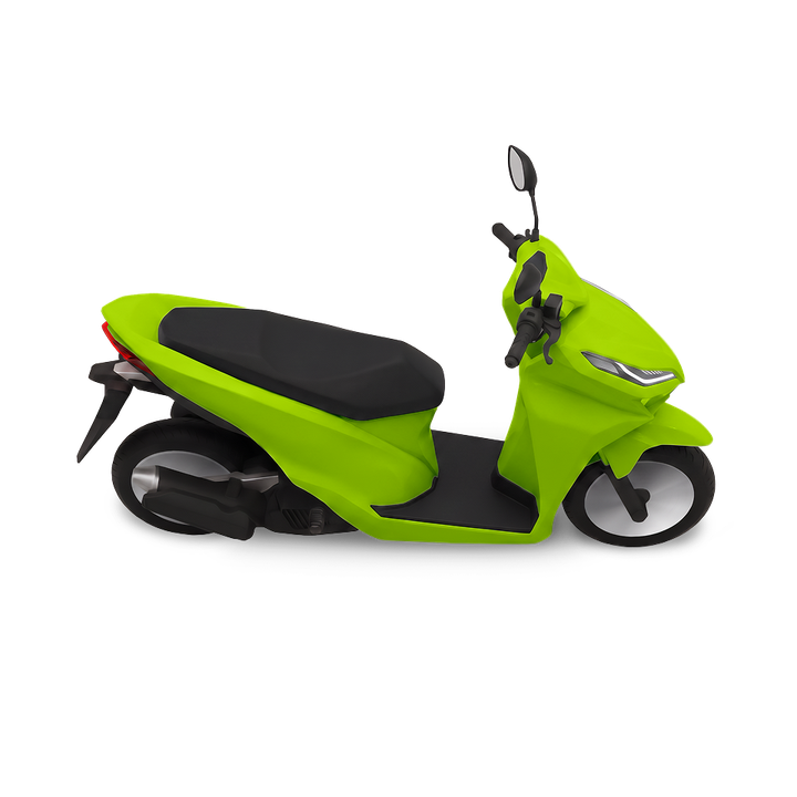
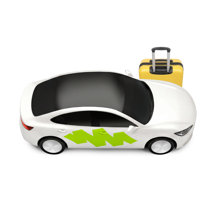
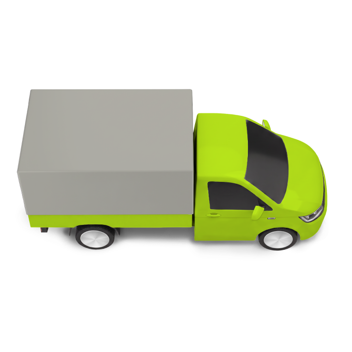
serviceCard · L / M / SEntry into a vertical: name + transport artwork. Three sizes from the designer tiles — L City Rides (artwork full-width, flush bottom) · M Couriers (crop window in the end corner) · S City to city / Freight. Two S plus the grid gap equal one M.
3
storyCardPromo story tile: headline over a full-bleed photo on a pastel or dark surface (--card-surface), 104 x 156.
1
Text
Text
customCard
2
City Rides
Couriers
City to city
Freight
serviceCard · L / M / S
3
Delivery from R$50
storyCard
States
Card has two states. It is static by default — interactive instances add .card--interactive and press with pushItem (see Animation), which is a motion behaviour rather than a separate state.
Standard
Text
Text
1
2
3
4
1
Background--surface-on-white — by default.Can be changed to any Surface / Background / Pastel colour style from the DS.
2
StartTextTitle — Main Body, --text-and-icon-primary (inherited from the root).Subtitle — Compact Body, --text-and-icon-secondary.Both text styles and colours can be changed per instance.
3
Slot content--text-and-icon-primary — icons inherit the root colour in StartSlot and EndSlot.A slot accepts any DS element; a non-default colour goes inline on that element.
4
CornerSlotCheckbox instance — box border --text-and-icon-secondary, radius var(--sp-s8).The var(--sp-s48) slot is the touch target; the card surface shows through (no background of its own).
Skeleton
1
2
3
1
Placeholder tint--surface-overlay — the Skeleton bars are re-tinted for this surface.Skeleton/OnWhite would not read against the beige card.
2
Icon placeholdervar(--sp-s24) square, radius var(--sp-s6) — stands in for the StartSlot icon. EndSlot has no placeholder.
3
Text placeholdersTitle bar — full width, skeleton-text--main-body.Subtitle bar — var(--sp-s80) wide, skeleton-text--compact-body.Stack gap 0 with space-between; CornerSlot hidden; the shimmer and its reduced-motion stop come from the Skeleton master.
Anatomy
Vertical stack on the card surface — StartSlot, StartText, EndSlot — plus the CornerSlot overlay pinned to the top-right corner. StartText is the only mandatory part.
Text
Text
1
2
3
4
1
StartSlotFree-content slot, fill × hug, left/top. IconContainer by default — any DS element.Optional, visible by default.
2
StartTextStack of TextRow instances, gap var(--sp-s4).Title — Main Body, --text-and-icon-primary (always visible).Subtitle — Compact Body, --text-and-icon-secondary (below the Title by default; can be off / above).
3
EndSlotSame contract as StartSlot — free content, fill × hug.Optional, visible by default.
4
CornerSlotvar(--sp-s48) × var(--sp-s48) touch target overlaying the top-right corner — Checkbox instance by default.Optional, visible by default. Mirrors to the top-left in RTL. Checkbox has no web master yet — the page composes it from the Figma geometry.
Layout
All internal spacing uses SP tokens. Width and height are instance-level (--card-width / --card-height): the default width is calc(var(--sp-s80) + var(--sp-s80)) — 160 — and the height hugs the content (136 with all slots visible).
customCard — default
Text
Text
Default — 160 × hug
Text
Width is set by the instance
--card-width: 320 — width and height are instance-level
GeneralVertical stack on --surface-on-white.var(--sp-s16) — padding on all sides.var(--sp-s8) — gap between StartSlot / StartText / EndSlot.var(--sp-s20) — roundness.var(--sp-s0) — border; instances may add 1px solid var(--border-default).
1
StartSlot / EndSlotFill × hug rows inside the padding area; the default IconContainer content is var(--sp-s24) tall.Free slots — any DS element fits (see Slot content below); the row hugs whatever height it gets.
2
StartTextGap var(--sp-s4) between the rows.Title line-height 20 · Subtitle line-height 16 — 40 total.
3
CornerSlotvar(--sp-s48) × var(--sp-s48) pinned to the top-right corner with var(--sp-s8) top/right padding — the 24px Checkbox lands var(--sp-s16) from both card edges.Overlay — it does not participate in the stack.
Slot content
IconContainer default
Icon
StartSlot fill × hug · align start / top
ImgContainer illustration / photo
Media
EndSlot fill × hug · align end / bottom
Tag, Button, Lottie host…
Control
Tag
EndSlot fill × fill · align end / center
A slot is a free containerStartSlot and EndSlot are Slot instances — fill × hug, no visual style of their own. IconContainer is the default content, not the only option.
1
IconContainervar(--sp-s24) DS icon inheriting --text-and-icon-primary — the default in both slots.
2
ImgContainerIllustration or photo: .card__artwork (full-width strip) or .card__img-container (crop window), positioned by the mediaPin axis with the media knobs from §4b.Card-owned content classes today — no standalone ImgContainer spec yet.
3
Any other DS elementTag, Button, Squircle, Rating, a Lottie animation host — whatever the composition needs.Nested components keep their own default classes and states (no opacity or colour bleed from the card); a non-default colour goes inline on that element.
Animation
The base card is static. Interactive instances add .card--interactive and press with the catalogued pushItem recipe (motion-rules §6.1 — cards are medium/large components: scale, not colour). Under prefers-reduced-motion: reduce both props resolve to 0ms — the scale applies instantly.
Motion
Card
Press & hold
Live: press and hold — pushItem scales the card to 95%. Pulses until you interact.
1
Press — pushItemScale 100% → 95% over var(--card-push-item-press) (200ms, standard-ease-in-out).
2
ReleaseScale 95% → 100% over var(--card-push-item-release) (200ms, standard-ease-in-out).
3
Skeleton shimmerOwned by the Skeleton component (Patterns/Shimmer) — the card only re-tints the placeholders.
Usage
Use when a discrete content unit needs its own surface — product tiles, category cards, option cards in a grid or a scrollable row. The CornerSlot makes a card selectable.
1
Selectable option cardA discrete choice with visual context — tapping the card (or its Checkbox) toggles the selection. One surface per option, options side by side.
2
A list row is not a CardA full-width tappable row inside a list is a Cell — it has no own surface and composes into a cell-list. Stretching a Card into a row duplicates Cell with the wrong contract.
Comfort
Newer cars
✓ Selectable option card — the CornerSlot Checkbox is the selection affordance
A display card reads as one group — "{Title}, {Subtitle}"; an interactive card is a button (or a link when it navigates). The two platforms carry the same structure and word it differently: an interactive card ends in "button" on VoiceOver and in "double-tap to activate" on TalkBack, and the nested Checkbox reads "checkbox, unchecked" against "not checked, checkbox". A Skeleton card is silent on both, with the owning container reporting the loading. The per-platform tables are the reference: specs/components/card/card-a11y.md.
Screen reader
Comfort
Newer cars
role="group" — Title + Subtitle announced together
Comfort
Newer cars
Checkbox — a separate focusable element with aria-checked
1
2
1
One announcement per cardNon-interactive card: role="group" with the label composed as "{Title}, {Subtitle}" (Title only when the Subtitle is hidden). Interactive card: role="button", same label.
2
CornerSlot Checkbox — independentAlways focusable separately from the card, with its own label and aria-checked state. Tab order: card root (if interactive) → Checkbox. Space toggles.
3
Skeleton — silentThe whole skeleton card is aria-hidden="true" and unfocusable; the owning container carries aria-busy="true" while loading.
Contrast
5
Text and icons on OnWhiteTitle --text-and-icon-primary and Subtitle --text-and-icon-secondary on --surface-on-white — ≥ 4.5:1. Slot icons and the Checkbox border — ≥ 3:1 (non-text UI). Skeleton placeholders are decorative and exempt.